MARCA

This concept combines two meanings: seafood and its location: Neptune's Cove, in the Caribbean.

un imagotipo donde se asocia el tridente a un tenedor y el pez como alimento, y en una segunda lectura el pez va del mar directo a la mesa.


This concept combines two meanings: seafood and its location: Neptune's Cove, in the Caribbean.

Imagotyped Brand, which mixes two concepts: The image of the moon with a plate


Imagotyped Brand, which mixes two concepts: The image of the moon with a plate

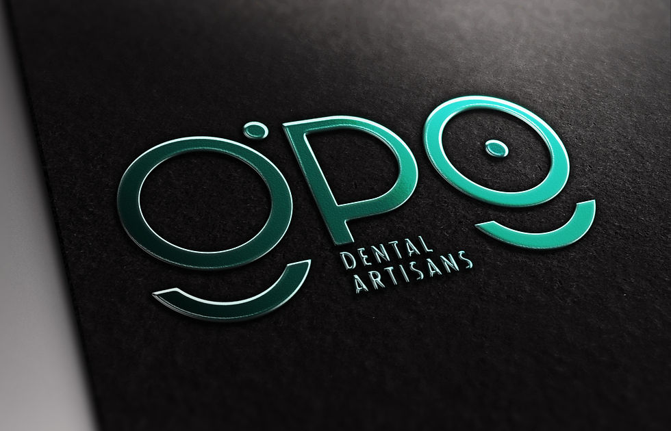
This brand is an Isotype that uses the singular design of its typography to create a smile in the second "G".

They are the initials of the name of the doctor to whom the visual identity is addressed


This brand is an Isotype that uses the singular design of its typography to create a smile in the second "G".

This logo reinforces in its concept the thread passing through the needle with the typography

Elegant, simple, Subtle


This logo reinforces in its concept the thread passing through the needle with the typography

Typographic work with a logo made for mainly dental and physical aesthetics.


Typographic work with a logo made for mainly dental and physical aesthetics.

Imagotype Created for the Cuban National League baseball team, from the province of La Isla de la Juventud

Visual union between a baseball and a pirate, reinforcing the idea of a pirate flag with two X-shaped bats


Imagotype Created for the Cuban National League baseball team, from the province of La Isla de la Juventud

Beauty salon located in an old "Comfort" mattress store from the mid 50's

Visual Identity of the Isotype type, where the letter K is worked in such a way that it gives an image of scissors. The typography is treated in such a way that it gives the illusion of hair.


Beauty salon located in an old "Comfort" mattress store from the mid 50's
DISEÑO WEB


Responsive Design for the People's Supreme Court, with more than 30 master pages


Responsive Design For the architecture and urban planning company RESTAURA

RESTAURA is a company that is characterized by its commitment to the rehabilitation of heritage built, through a multidisciplinary work team


Responsive Design For the architecture and urban planning company RESTAURA


ANIMACIÓN
EDITORIAL


Editorial design for the Tourism Magazine "Welcome Caribe" of the year 2018


Editorial design for the Tourism Magazine "Welcome Caribe" of the year 2018
GRÁFICA AMBIENTAL

Museum dedicated to the first university of Cuba

It has several rooms, each one represented in a different color, with a graphic that inspires modernity and tradition


Museum dedicated to the first university of Cuba


Posters created for the 500th Anniversary of the City of Havana in Cuba


Posters created for the 500th Anniversary of the City of Havana in Cuba

Gym with years of history, made mainly for the elderly and workers in the historic center of the city


Gym with years of history, made mainly for the elderly and workers in the historic center of the city
DISEÑO DE SEÑALÉTICA


A linear treatment in which curves are combined geometric and straight, making use of the style features used in the visual identity


Signs for Los Marinos restaurant. made in acrylic to give transparency and create a water effect

The Pictograms respond to the style of the visual identity


Signs for Los Marinos restaurant. made in acrylic to give transparency and create a water effect


